
LEXICON
Download the game here!
CLIENT: In-house
DEPLOYMENT: In Beta
PLATFORM: PC/Mobile
PROGRAMS: Unity3D, Krita
DEPLOYMENT: In Beta
PLATFORM: PC/Mobile
PROGRAMS: Unity3D, Krita
OBJECTIVE: Make a game that has a low learning curve, easy to pick up, and hard to master. All the while having quality visuals and sounds to create a fun and lighthearted experience.
CONCEPT: Creating an engaging and relaxing spelling game for iOS and Android.
CONCEPT: Creating an engaging and relaxing spelling game for iOS and Android.
Game Preview
SYNOPSIS
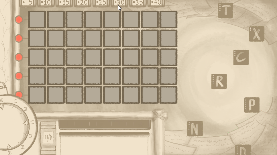
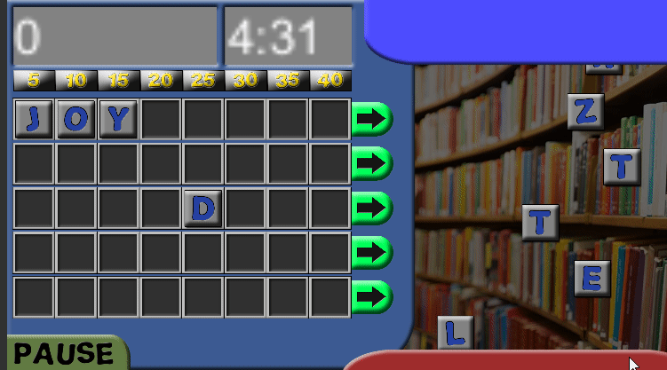
Lexicon is a word puzzle similar in gameplay to scrabble. The game is intended for mobile distribution. However, Lexicon introduces expediency by presenting gameplay pieces that are animated and are available for a limited time (varied). In addition, player scoring is compounded by providing five shuffle boards to arrange puzzle pieces.
Currently, the scope of the game is limited to a single player competing against time. The coding structure is devised to present pieces randomly, the implication being that accelerated gameplay does not include devising certain pre-programmed pathways, which would allow players to anticipate certain patterns. The gameplay intentionally focuses attention on random presentation of letters.
SNAPSHOTS
Custom Assets
Assets tailor-made to fit the scratch-book theme designed by our artists.
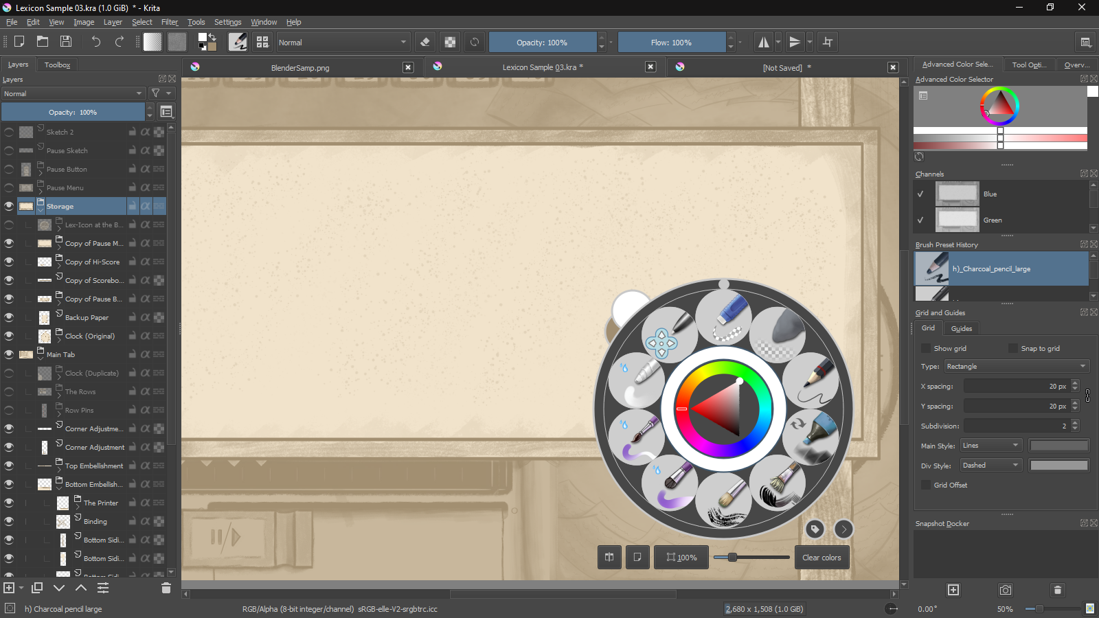
OUR PROCESS
Early Version with Placeholder Assets
At its core, Lexicon is a simple yet charming game. Our team sought to embody that principle within the mechanics of the game, as well as in the structure of code. At each step of the game's creation, developing the mechanics and systems around them, we constantly ask ourselves how the code could be made simpler, more resilient, while still upholding our design and gameplay goals. To accomplish this, we are constantly looking for ways to perfect the code that is currently in place, questioning why a particular piece was made the way it was; does its current design contribute to our goals? Through the continual process of questioning and writing, our team is able to carry out its goals and create a fun and engaging game.
Our lead artist was able to take the design of the previous Lexicon and reimagine it, the only guiding priority being that whatever art style the game would use had to resonate with it’s core themes: prioritizing simplicity, and calming atmosphere.
Along the way, Alex needed to answer many questions. How do we create letters that are visually appealing, easily recognizable, and wholly unique? How would time be displayed clearly without being too basic? Most importantly, how can the art be designed from the ground up to support a variety of screen sizes?
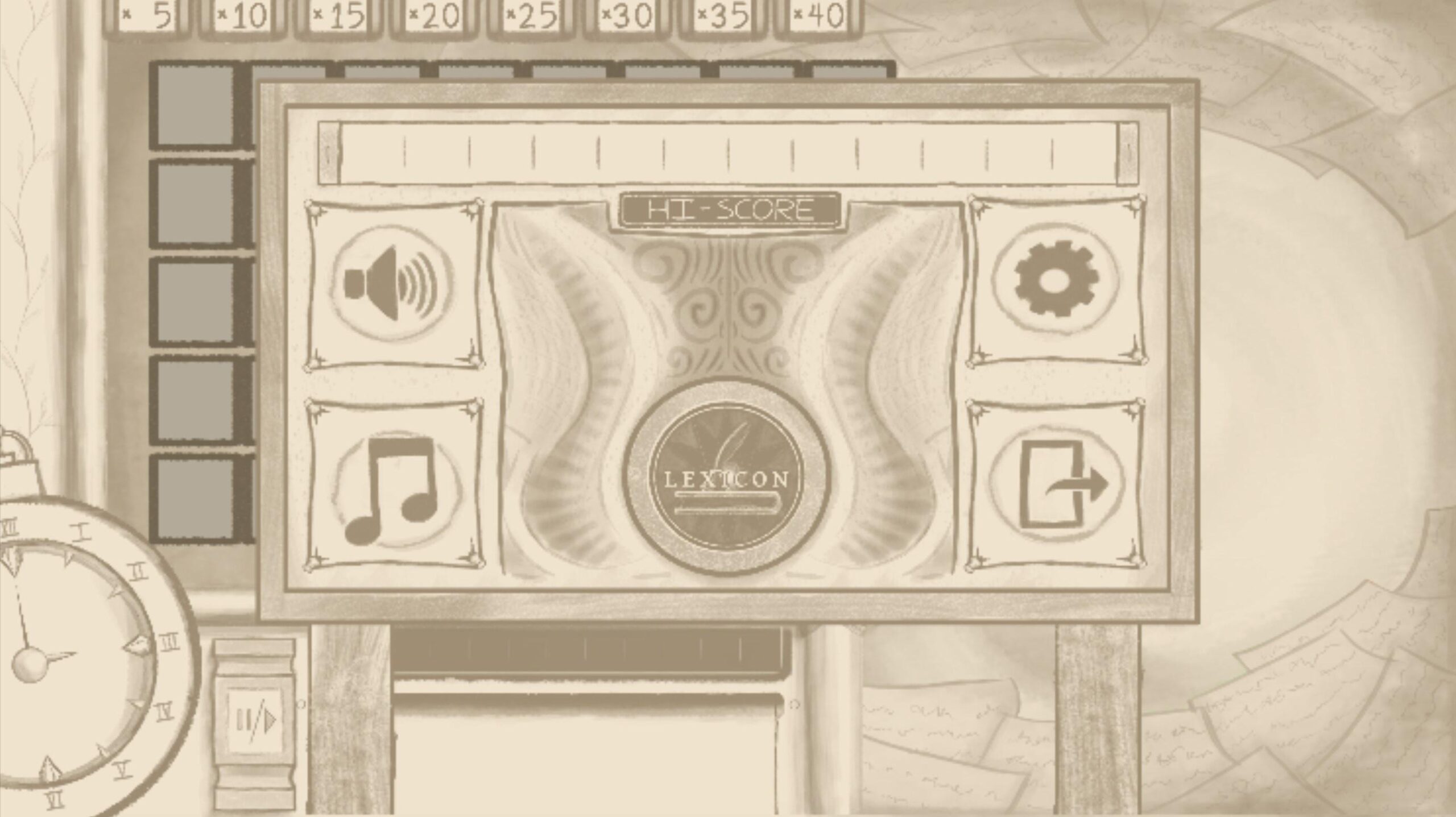
Ultimately, the team settled quickly on a scratch-book, paper like art style. The art style’s messy nature reinforced the game’s lighthearted core experience, and the style’s use of colors and shading reinforced the game’s simplicity.
Something that served as a bit of a unifying thematic element, visually, was an earnest yearning for earlier years and (somewhat) simpler times. Bamboo framing for UI elements, sheafs of paper in the background, a rocker tab for a pause button, words dropped by pulling pins, the running commentary for the game being printed out a sheet of paper, and the pause menu being sheets of paper held to a corkboard by pins… it’s all very deliberately looking back with a wistful sense of nostalgia.